
The art of data visualization: Making your coffee shop data tell stories
Choose the right chart and let your data speak for itself

👋🏽 Hey, it’s Ismail. Welcome to data nomads lab newsletter on learning data analytics, career growth, networking, building portfolios, and interview skills to break into tech role as a high-performer.
Last time we talked about different types of data. Today, let us learn how to make that data visual and engaging. Think of data visualization like the difference between reading a recipe and watching a cooking show - both tell you how to make the dish, but one is way more engaging!
Why do we need data visualization?
Before we jump in, let us talk about why visualization matters:
It helps spot patterns and trends quickly
Makes complex information digestible
Helps communicate insights to others
Makes it easier to compare different metrics
Helps identify outliers and unusual patterns
Let us look at the visualizations in action!
The most common Charts: Bar Charts, Line Charts, Pie Charts, Histogram and Scatterplot. These chart types, or a combination of them, provide answers to most questions with relational data (data stores in tables).
I have created some charts using our coffee shop data below. Each one tells a different story about our business.
Understanding each chart type
1. Bar Charts: The reliable workhorse
Best for:
Comparing categories (like drink types)
Showing counts or frequencies
Discrete data visualization
When to use it: Use bar charts when you want to compare different categories or show the frequency of different items. In our coffee shop example, it perfectly shows which drinks are our bestsellers.
Pro tip: Use horizontal bars when you have long category names!

When creating a bar chart, do not:
Make each bar a different width
Cram too many bars into subcategories
Leave the axes unlabeled
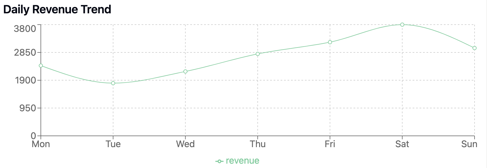
2. Line Charts: The trend spotter
Best for:
Time series data: What patterns appear in the data over time?
Showing trends and patterns
Continuous data over time
Is one category performing better than other sets of data?
When to use it: Perfect for showing how your sales or customer traffic changes over time. It helps identify patterns like peak hours or seasonal trends.
3. Pie Charts: The part-to-whol
e visualizer
Best for:
Showing proportions of a whole
Comparing parts to the total
Limited number of categories (ideally ≤ 6)
When to use it: Great for showing the breakdown of your total sales by category or the distribution of drink sizes. Just remember - too many slices make the pie hard to digest!

When to avoid pie charts:
Your data has more than 5 categories (use a bar chart instead)
Categories have very similar values (makes segments hard to compare)
Values do not sum to 100% (breaks the “part of whole” concept)
Data includes negative numbers or complex fractions
4. Histograms: Understanding your data's distribution
Best for:
Showing distribution of continuous data
Understanding the spread of values
Identifying patterns in frequency
When to use it: Perfect for analyzing the distribution of order values, wait times, or daily customer counts. It helps you understand what's "normal" for your business and spot unusual patterns.

Avoid using a histogram if:
Looking at relationships between multiple variables
Data needs to be normalized or rescaled first
You need to see exact individual values rather than general patterns
5. Scatter Plots: Finding relationships in your data
Best for:
Showing relationships between two variables
Identifying clusters
Spotting outliers
When to use it: Perfect for exploring relationships, like whether longer wait times affect order values, or if there is a connection between time of day and order size.

Reading correlations:
No correlation: Points spread randomly - no relationship between variables
Positive correlation: As one variable increases, the other tends to increase
Negative correlation: As one variable increases, the other tends to decrease

For example, in a coffee shop:
Positive correlation: More customers → Higher daily revenue
Negative correlation: Longer wait times → Lower customer satisfaction
No correlation: Drink temperature → Time of purchase
Common mistakes to avoid
Wrong chart type: Do not use a pie chart for time series data!
Too much information: Keep it simple and focused
Misleading scales: Always start your y-axis at zero for bar charts
Poor color choices: Use colors that are colorblind-friendly
Missing context: Always include clear labels and titles
Quick decision guide
Not sure which chart to use? Here is a simple guide:
Comparing categories? → Bar chart
Looking at trends over time? → Line chart
Showing parts of a whole? → Pie chart
Exploring relationships? → Scatter plot
Understanding distributions? → Histogram
Practice time!
Look at your own coffee shop data (or any business data you have) and try creating these different visualizations. Ask yourself:
What story am I trying to tell?
Who is my audience?
Which visualization best serves my purpose?
Share your visualizations in the comments below! I would love to see how you are applying these concepts to your own data.
Stay curious!
Ismail Osman
Want to practice more? Try creating different visualizations for the same dataset and see how the story changes. Drop your insights in the comments!